TRACKERS UX
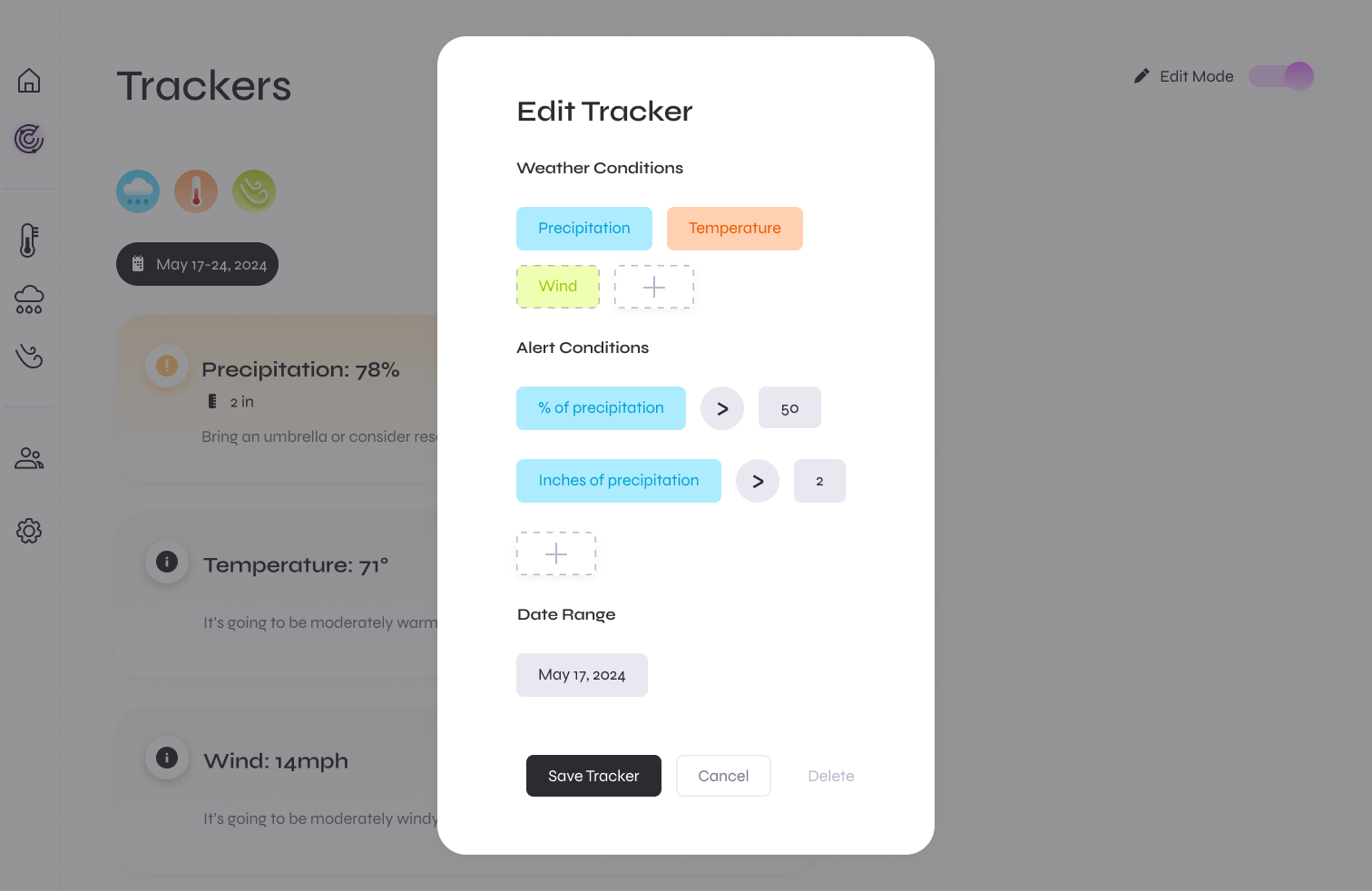
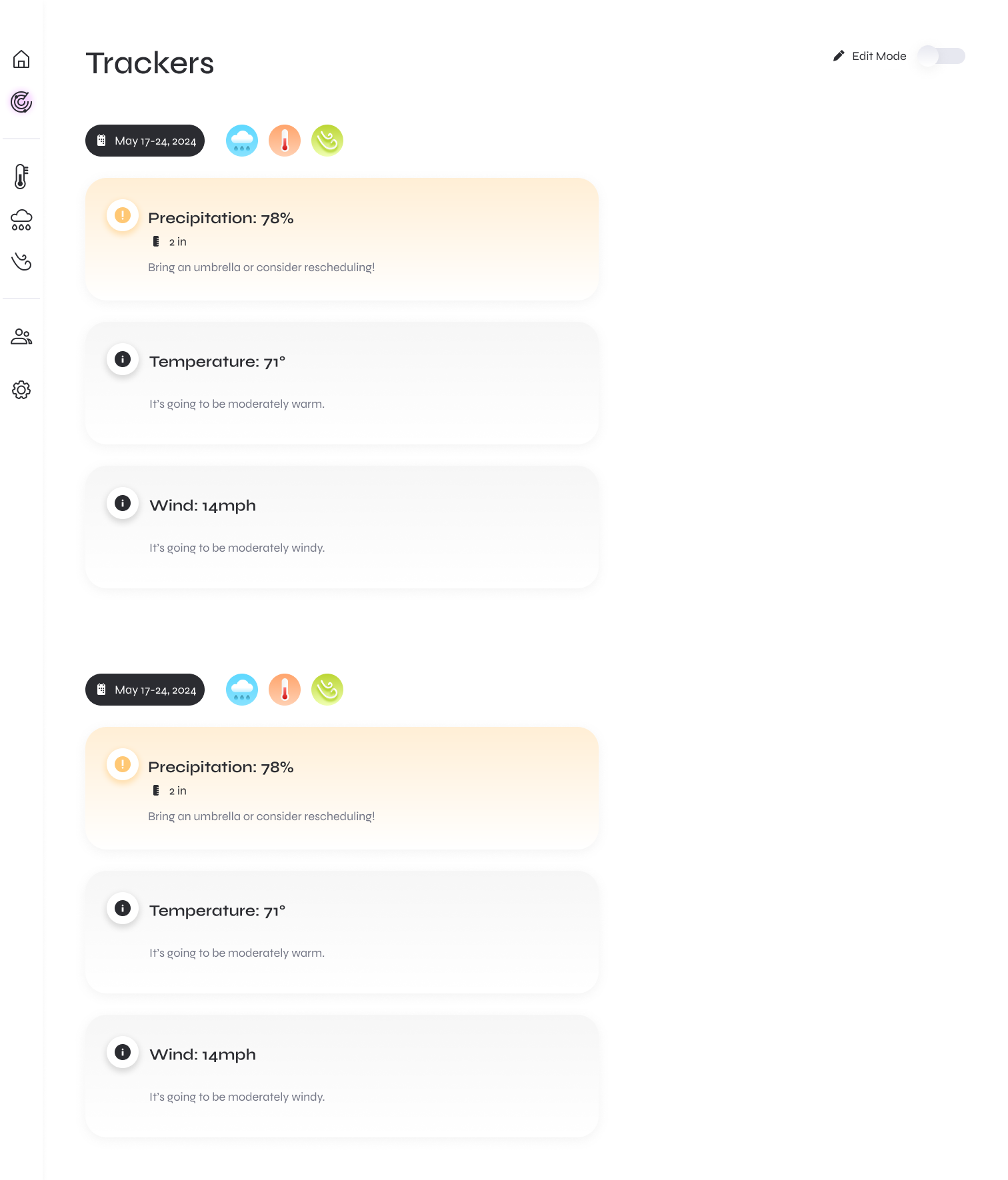
Threshold-aware cards: When a user’s metric (e.g., precip > 50%) threshold limit is exceeded, the card turns yellow/orange and elevates the headline stat; a short action line translates it into a decision.
.png)
User control: Thresholds are editable per Tracker.
Progressive disclosure: “+” chips reveal optional conditions so users only see what they need, allowing for fast initial setup.
Consistent color mapping: Weather metrics use the same color across icons, chips, charts, and controls, helping users quickly recognize each metric throughout the product.
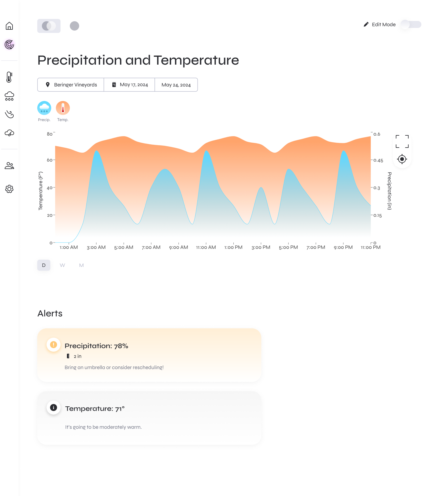
This page shows one tracker’s window (venue + dates) with only the metrics selected for that tracker.
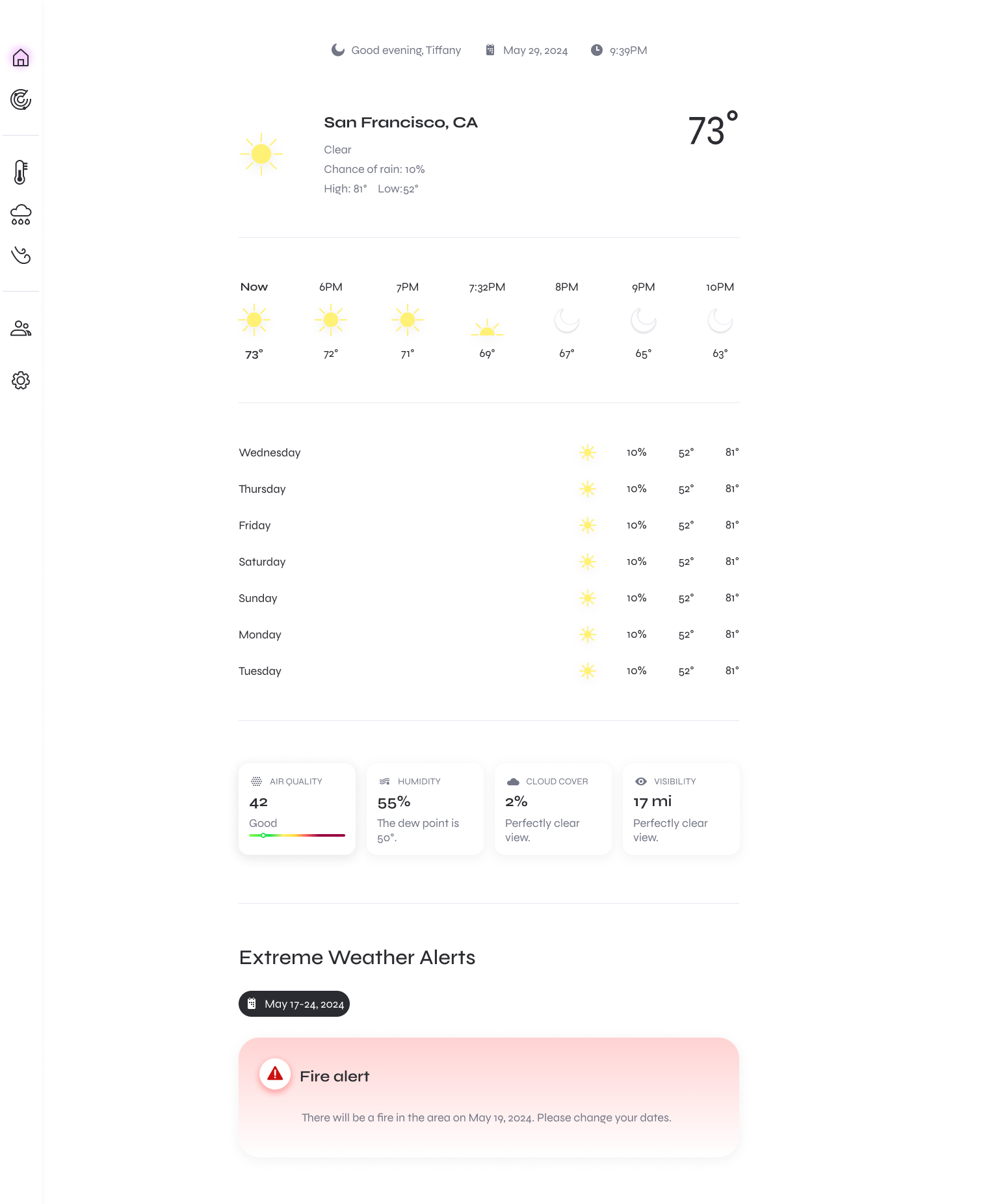
Alerts panel: When a threshold is crossed, the tracker surfaces a clear alert directly below the chart, along with relevant guidance. Keeping alerts within the tracker makes them easier to connect to the specific event instead of burying them in the global weather view.
Focused weather view: The chart keeps the same visual language as Home, but narrows the data to one tracker so users can quickly understand the conditions around that event.
Edit on demand: Edit Mode toggles configuration without cluttering read mode.

.svg)
.png)