.png)
Nima Labs
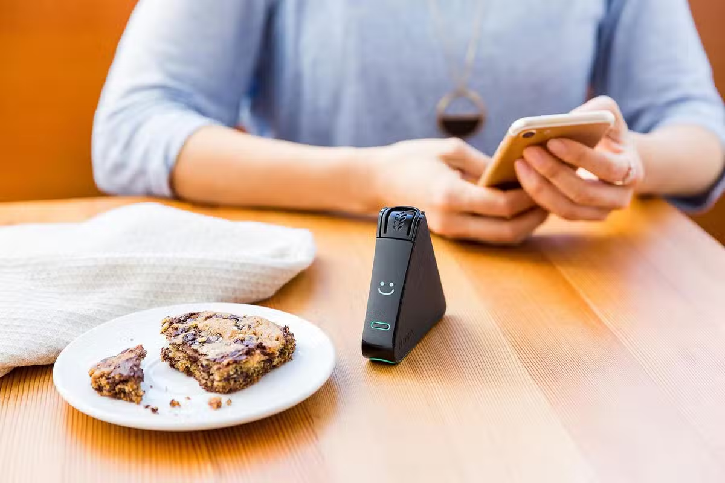
Nima Sensor is the world’s first portable allergen sensor, designed to give people peace of mind when eating out or at home.
As a product design intern, I led a new feature project focused on strengthening the app’s community. I made it easier for users to share tests and reviews and made that activity more visible across the product.
Product Design, PM, Front-end
A video ad I helped produce and edit.
defining "contributions"
Nima automatically logs every test result. But it only becomes a contribution once a user adds details and submits it to the community.
That distinction shaped the profile experience. I focused on helping people finish and share what they’d already logged.
MORE ON CONTRIBUTIONS
Contribute a test: add details to an auto-logged test + submit.
Contribute a review: write about an item/place and accommodations
Contribution rate: % of logged tests/reviews that get completed + submitted
Problem
Contributions are what make Nima useful. People rely on them to decide what’s safe to eat and where they can dine with confidence. The challenge was a classic cold start problem, so my goal was to increase the test and review contribution rates.
Kick-off
We didn’t have much formal user data, so I started with foundational research in two areas:
1) the broader food allergy experience
2) how people use the Nima app
user interviews
I interviewed 10 users in person, then used short task-based tests and in-app A/B tests to pinpoint where people dropped off while contributing.
Distilling the broader allergy experience
One word came up again and again when I asked people to describe living with food allergies: “lonely.”
Many users told me they avoid bringing up their allergies because they don’t want to be a burden, or they’ve been dismissed in the past.
When there aren’t enough shared tests and reviews to lean on, that loneliness is magnified.
.png)
Distilling the app experience
I grouped the pain points I heard into two main motivations for using Nima.
.png)
Emotional Ellies are motivated by impact. Low activity makes contributing feel pointless.
.png)
Practical Pams are motivated by confidence. Too few tests makes the app feel unreliable.
That gave me a clear design direction: make contributing feel worthwhile for Impact-driven users, and make results feel trustworthy for Confidence-driven users.
process
I mapped the contribution flow end-to-end, identified the biggest drop-off points, sketched fixes, and iterated in higher fidelity with quick feedback from the team.
We explored a few possible homes for the feature and landed on the profile as the best place.
I paired quick sketches with short “what the user is trying to do” notes so we could align on priorities before moving into high-fidelity.
.png)
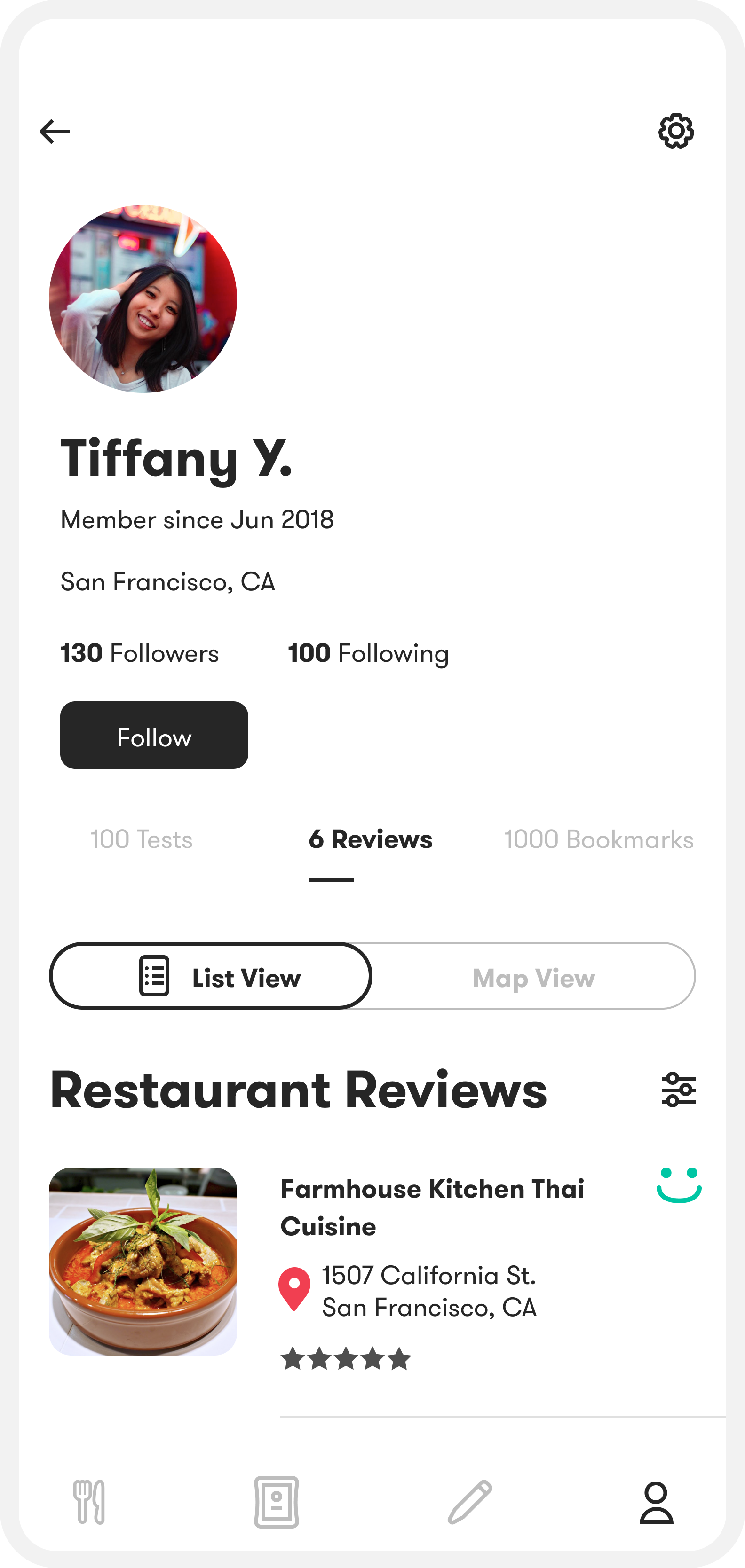
why profile
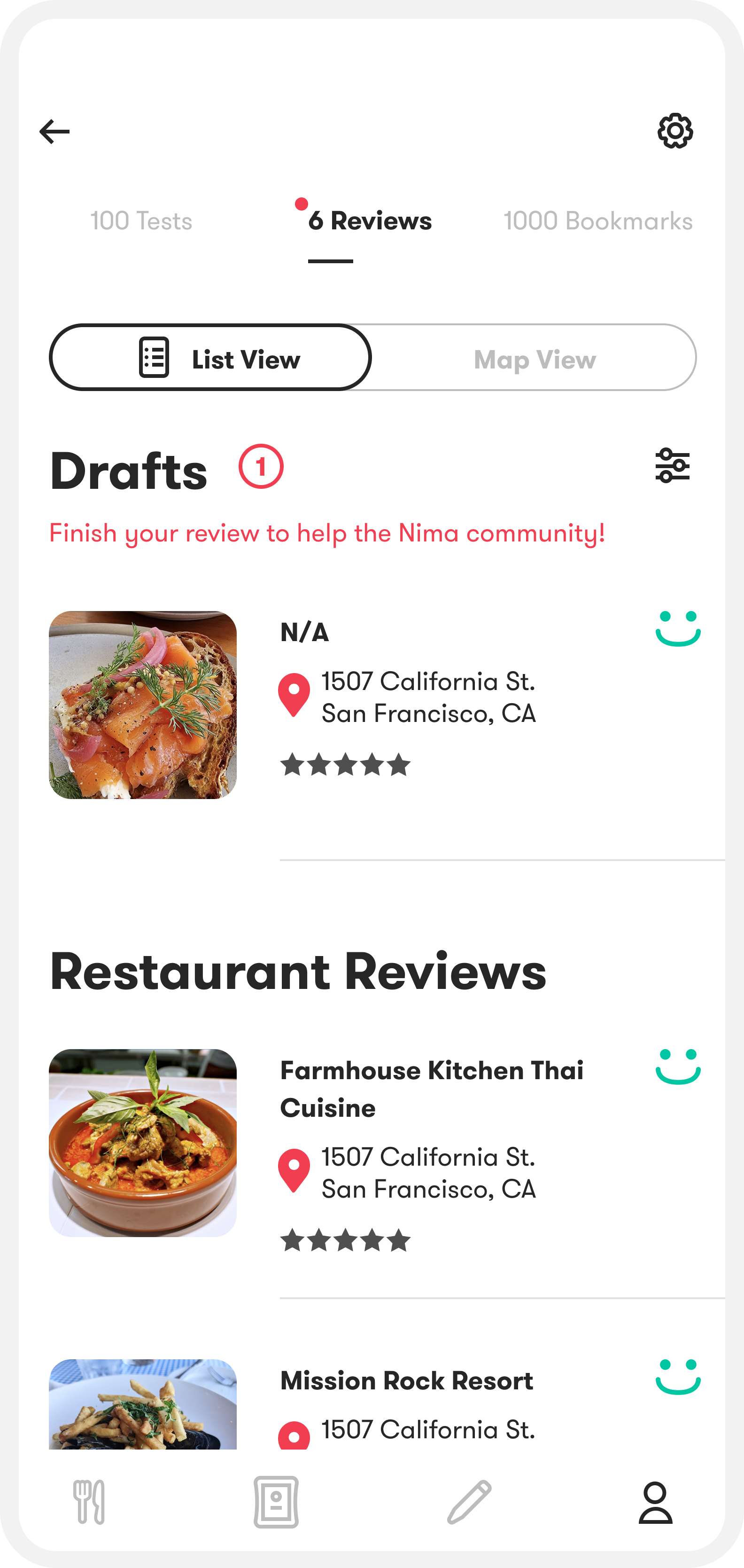
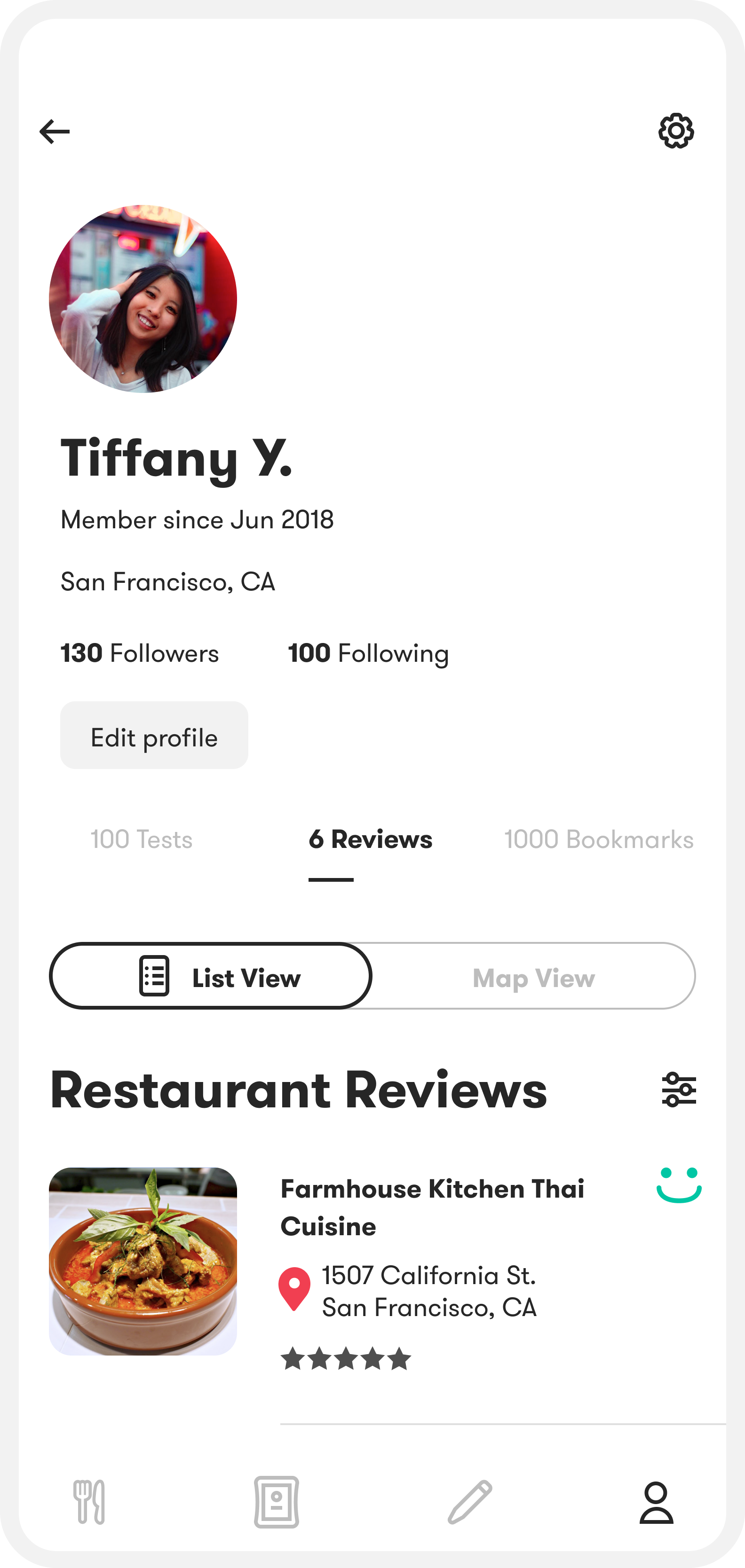
The profile is where users already review their test history, so it was the natural place to turn logged tests into completed contributions.
We reduced the steps to finish and submit, then made that activity visible on their public profile.
The goal was simple: remove friction to contribute, and surface activity so the product feels useful and trustworthy.
Make activity visible
Signaling and encouraging engagement
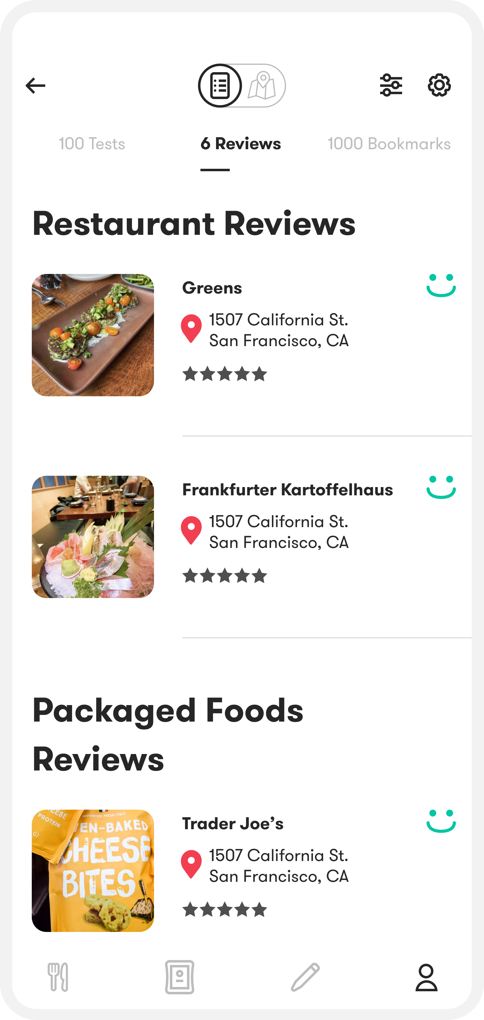
As you scroll, I pin Reviews, Tests, and Bookmarks to the top so it’s always easy to switch sections. I also show counts in the tab labels (e.g., 6 Reviews) to give an immediate sense of activity and encourage people to tap in and explore.
Make it easy to scan + remember
Pinned context for scanning
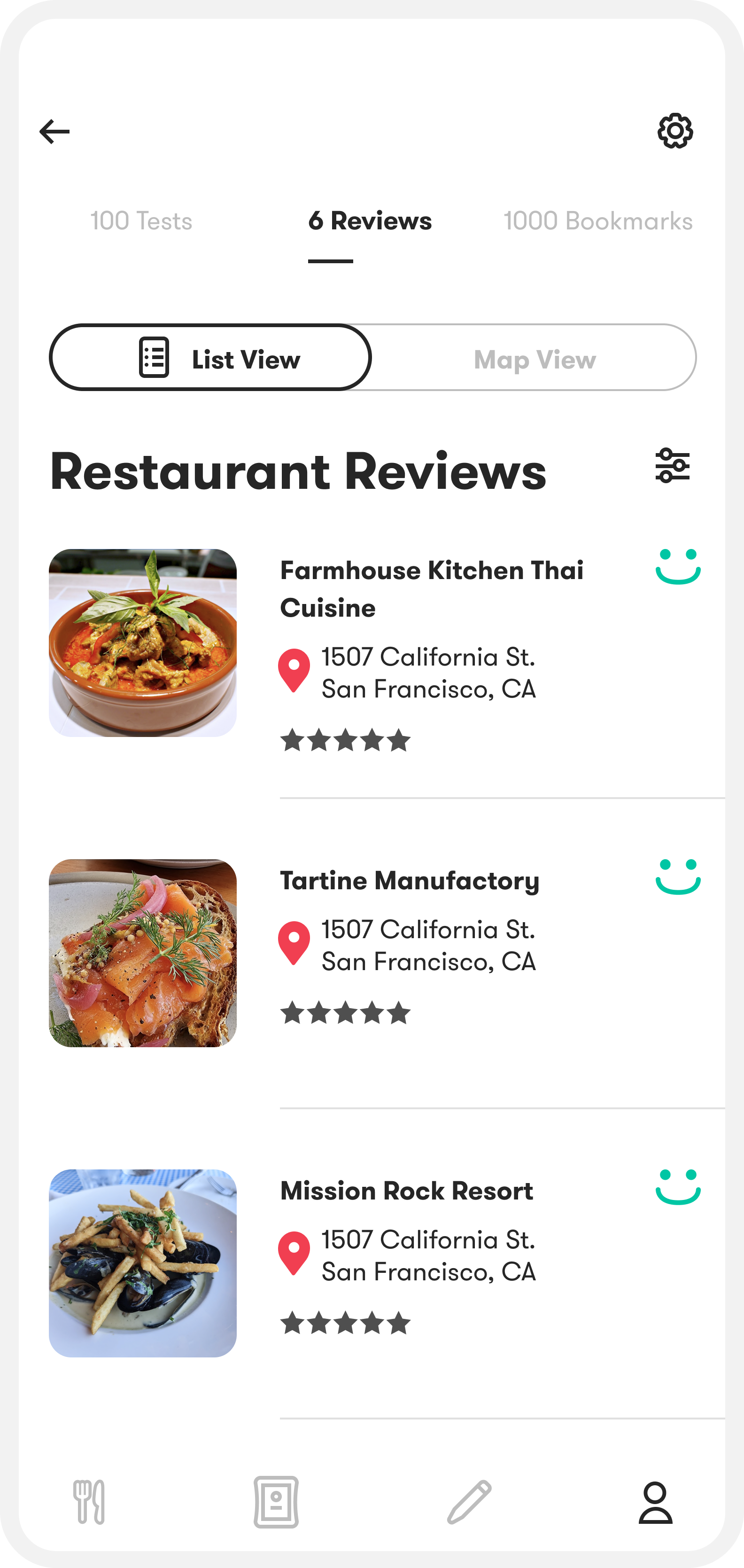
I designed the list/map toggle to dock to the top once you start scrolling, so it stays reachable without taking up space.
I also keep the page title pinned so users always know what they’re looking at as they move through the list.
Reduced cognitive load
As the number of tests and reviews scale, the page starts to feel overcrowded. I kept each item collapsed by default and only surface the key details until someone expands it.
Collapsed (left), expanded (right).
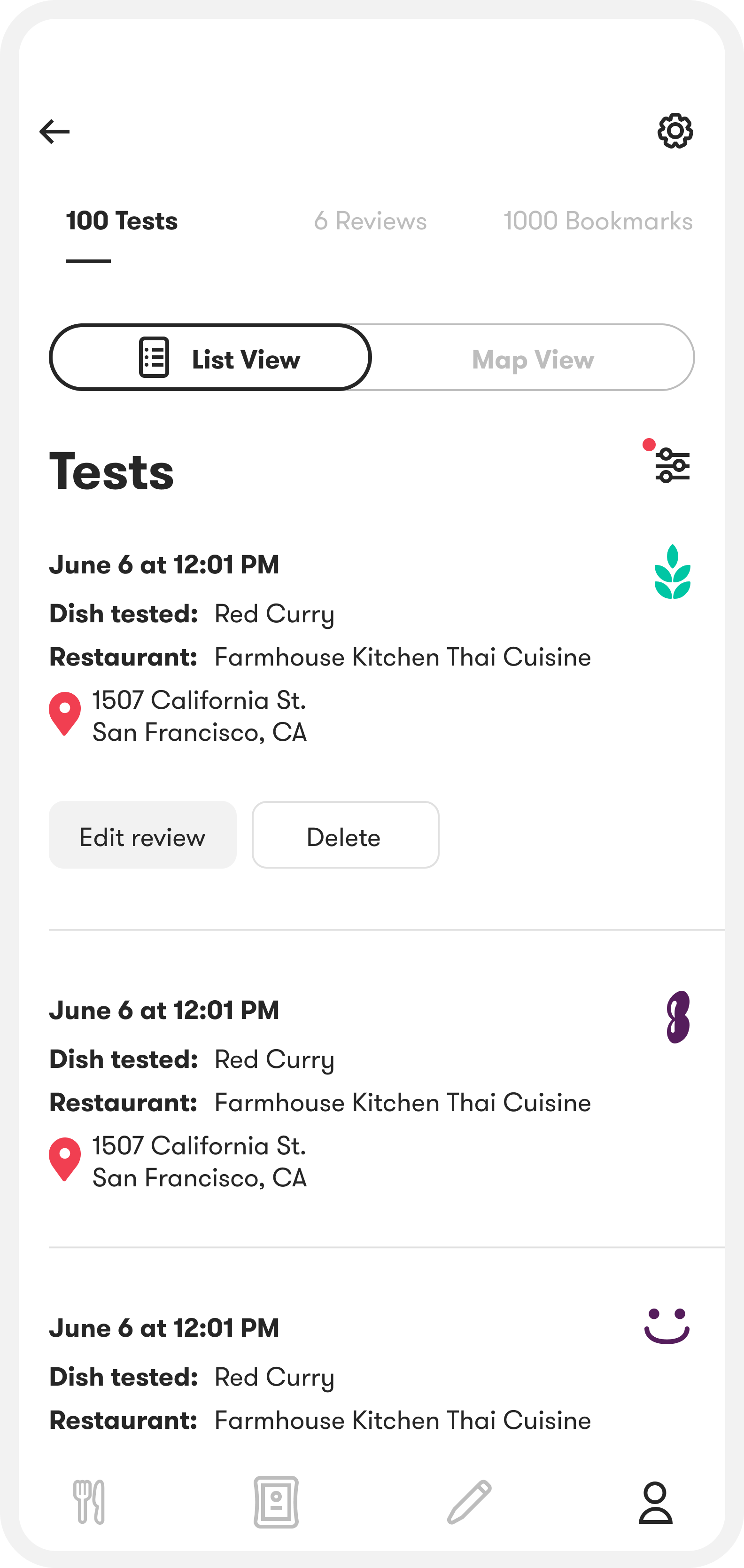
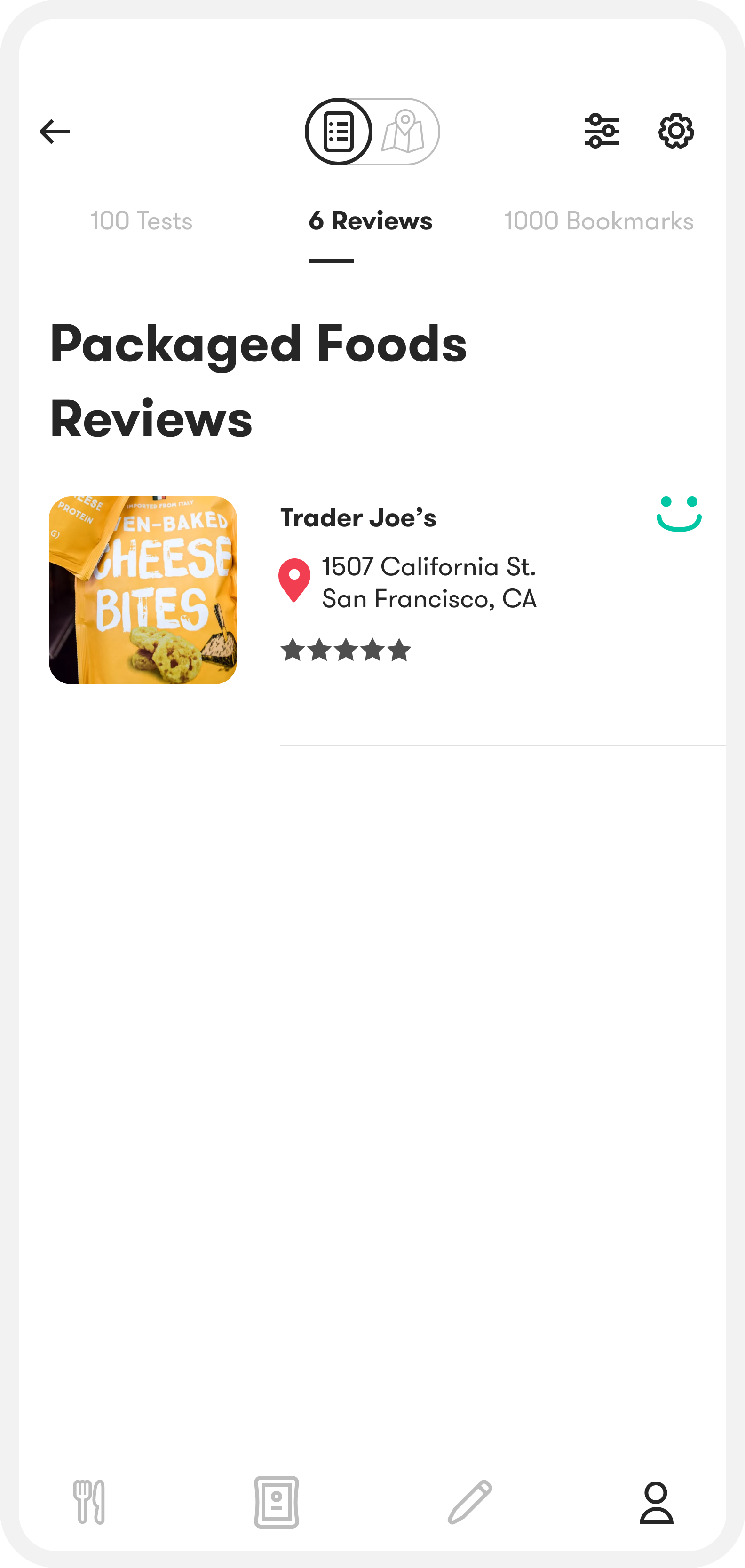
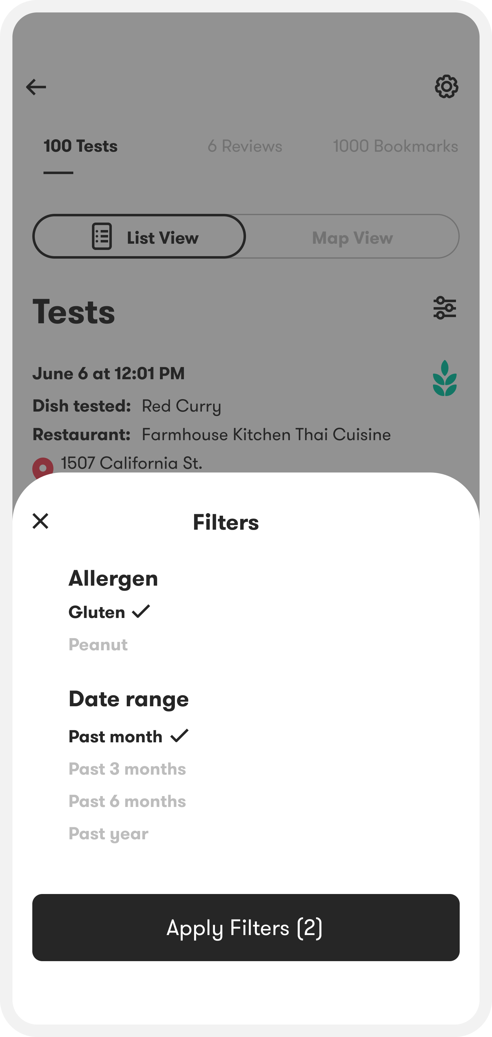
Quick filtering
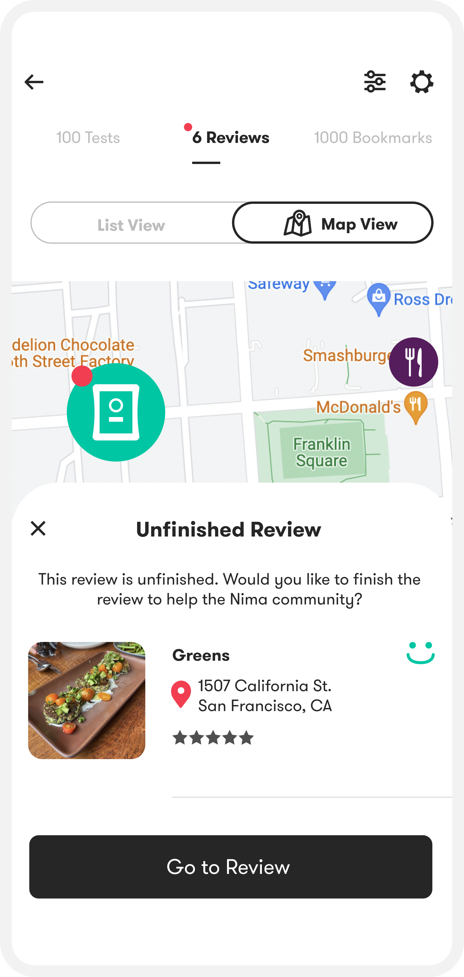
Filters make it easy to pull up relevant history, like recent gluten tests, and share a focused view of your results. This makes the profile more useful as a reference.
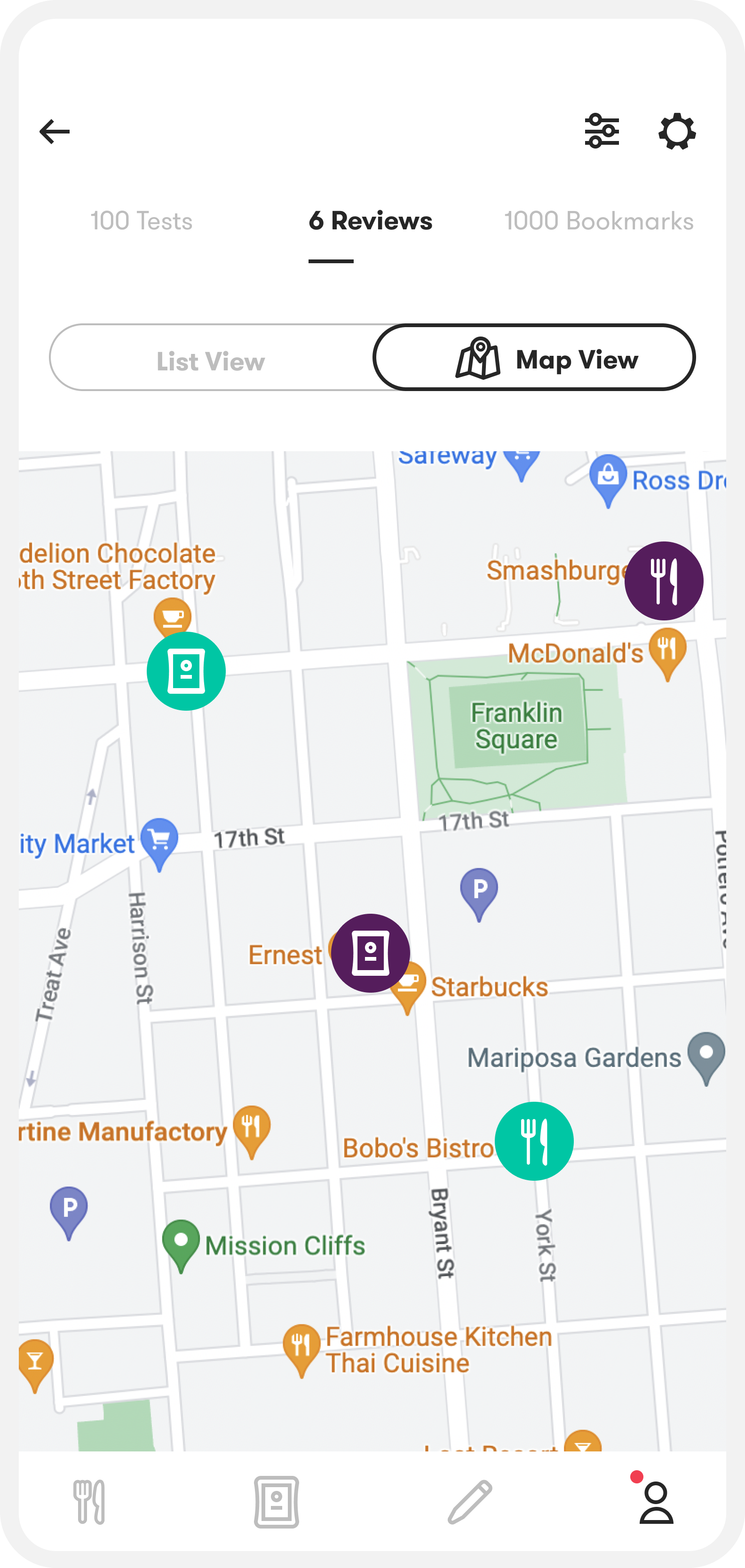
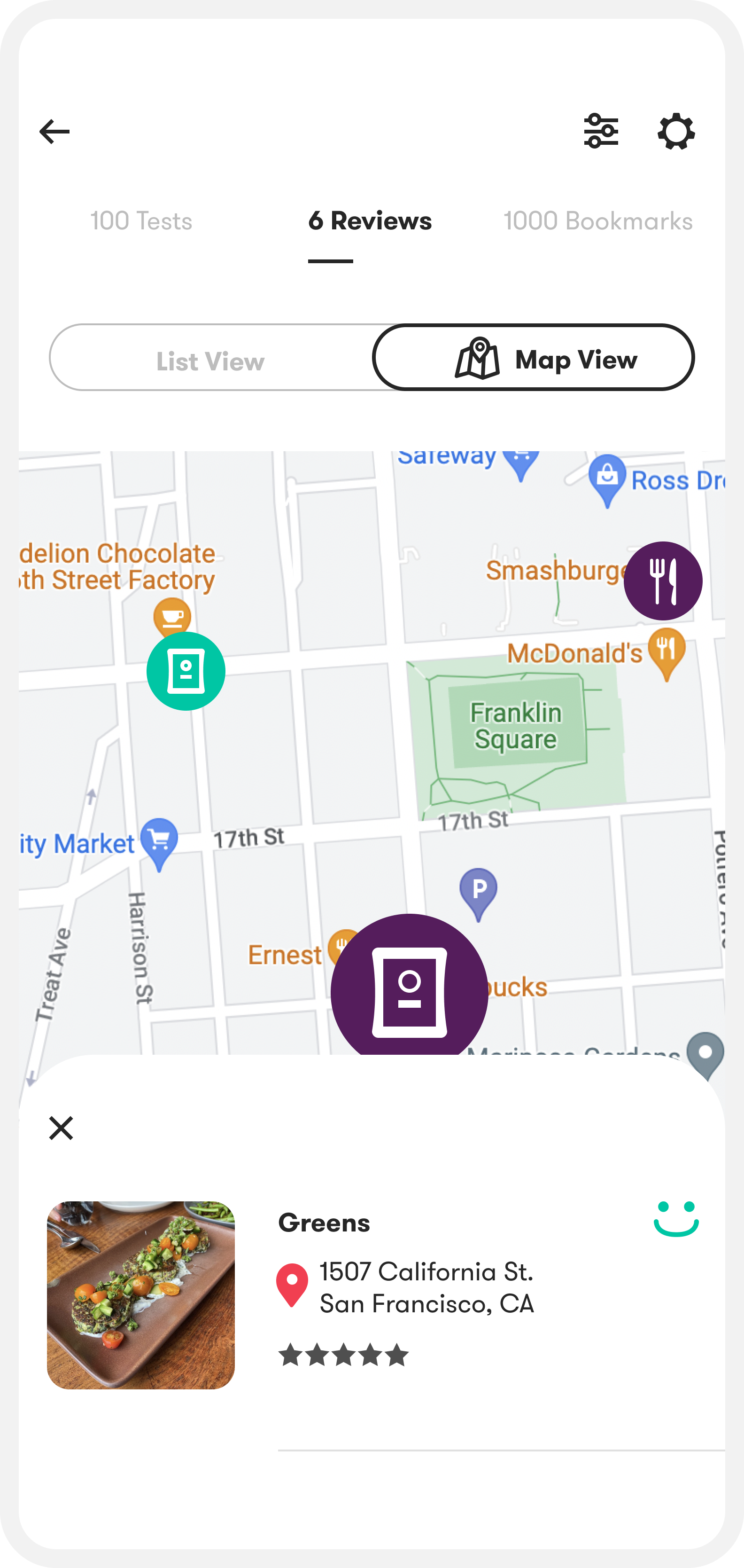
LIST VIEW VS MAP VIEW
I added a list/map toggle for reviews and bookmarks so users can scan fast, then use location cues on the map to fill in missed entries. Tests use the same list/map view.
testing and validation
After interviewing 10 users in person, I ran short task-based tests and in-app A/B tests to pinpoint friction in the contribution flow and evaluate key browsing patterns.
what i tested and why
Counterbalancing list vs map
I varied whether users saw list view or map view first so preferences were less likely to be driven by whichever layout appeared first.
Goal-first tasks
Instead of asking “Which view do you like?”, I gave users a concrete goal: pick a restaurant they would want to learn more about in each view. This let me evaluate the designs in a realistic decision-making context.
Reasoning after the choice
I asked users to explain why they preferred a view only after they made a selection. This helped me capture their real decision, then validate whether their reasoning matched what they normally look for when choosing a restaurant.
What I learned
Most users clicked into a restaurant page and read reviews before deciding whether to save it somewhere else (often Google Maps). When users preferred a compact view, it was usually because they only needed the result signal (happy face vs allergen icon) and the food photo up front, and everything else could be one tap deeper.
Results
Three months after launching the profile feature to beta users, active users increased by 16% and overall contributions increased by 11%.

.svg)